Building a Form
Every form has the same builder. This builder constructs the form as it will be seen by the platform users.

The builder has 4 functional areas: the header, the forms and elements menu, the body of the form, and the component details.
Header

The header provides, in order from left to right:
- Access back to the form settings
- The name of the form
- When the form was last saved
- An Action menu that allows you to
- Preview the form in your browser. This (if your bundle is ready and set up) will allow you to see the form as your users would see it. Note that you still will have your access/permissions, which can occassionally change the experience.
- Reset your form. This means remove the changes made since the last save.
- Export the form.
- View the submissions for the form.
- Save the form
- Access the Internal Application Help.
Fields and Elements
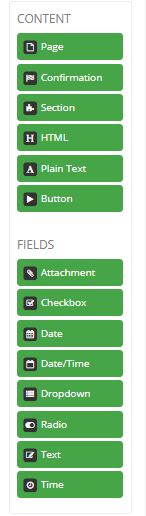
Below the header, the left hand side of the screen presents all of the options for elements and fields you can use on your form. You drag these into the desired place in the middle section of the screen to apply that item to the form.
Elements
- Page: There must be at least one page on every form. This is the base element of sectioning the form. Pages have:
- Name
- Display Condition: If this evaluates to true, the page will display for the user. Default: true
- Advance Condition: If this evaluates to true, the user will be allowed to advance from this page to the next/submit the page. Default: true.
- Events: It is possible to run events/scripts on Load or Submit of the page.
- Display Page: This allows you to specify a different display page for this service item from the standard applied by the kapp and form settings.
The pages are used to contain all the other elements and fields for display to the users.
- Confirmation: Confirmation is a specific type of page. It is meant to display as a confirmation after form submission. A form cenerally has one confirmation page, but it is possible to have more (with different display conditions). Confirmation pages are pages and so have all the same attributes as regular pages.
- Section: Sections are meant to be collections of other elements, either for functional (eg. display/remove) or visual (eg. decorative) purposes. As such, sections are simple elements with:
- Name
- Optional (displayed) Title
- Display rules
- Render Attributes
Details on the sections such as Visibility rules and Render Attributes will be covered when discussing the third form builder section.
- HTML: HTML fields will allow you to enter HTML and will render that HTML when the form is displayed. These are also very simple, with:
- Name
- Content
- Display rules
- Render Attributes
- Plain Text: Plain text are text fields that will always render plain text. These are, essentially, inside an html pre tag. They have the same components as HTML fields.
- Button: There are multiple types of button. Once you put a button on your form, you can deside which type it is:
- Submit Page: submits the page and advances as validations, submit events, advance conditions, and display conditions specify.
- Previous Page: returns to the previous page (does not save content changed since the last save in this page.
- Save for Later: saves the content on this page and reloads the page.
- Custom
Note that the custom page is the only type of button that allows you to define the event/script associated with it. The others are all preconfigured actions. So, for example, if you wanted to go to the previous page, but wanted to save the current page first, you would need to use a custom button and use the javascripts provided for the save for later and previous page functionalities to achieve the desired button event.
Fields
Fields have very similar sections in the field details (the third form builder section). These will all be reviewed in that section below. Only the field differences will notes here.
- Attachment: This field is for allowing users to upload attachment(s). One field can hold one or many attachments. Unlike all other field types, attachment fields do not accept defaults. Attachments can be limited in number, size, or file type by using custom constaints (described below).
- Checkbox: This will display the options configured in the choices section (described below) in a checkbox format for your users.
- Date: This will provide a date field for your users. This will appear like a text field, but will pop-up a calendar when clicked on. Web interfaces shown are from the Base bundle. Different bundles have the option to present different interfaces.

Select a date by clicking on the day. Arrows along the top take you back and forth one month. The home icon brings you back to the current month. Dropdowns for month and year allow you to navigate larger changes easily.
Typing directly in the field is allowed with an expected format of mm/dd/yyyy. The answer is stored in ISO 8601 format - yyyy-mm-dd.
- Date/Time:This will provide a date and time field for your users. This will appear like a text field, but will pop-up a calendar when clicked on. Web interfaces shown are from the Base bundle. Different bundles have the option to present different interfaces.
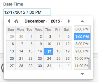
The Date operates the same and the time dialog slider is set to the right. If you just select the date, the time defaults to your current time. The expected format in the field is mm/dd/yyyy hh:mm. You can use either AM/PM or 24 hour time.
The answer is stored in ISO 8601 format - yyyy-mm-ddThh:mm:ss+00:00.
Seconds are not set via the web console and are always set 00. The value after the + sign is the time zone offset. All values are store GMT (+00:00).
- Dropdown: This will display the options configured in the choices section (described below) in a dropdown box for your users.
- Radio: This will display the options configured in the choices section (described below) in a radio button format for your users.
- Text: This will display a text field with the configured number of rows, from asking someone their name (1 line) to asking someone for comments (3-5 lines). Validations can be as strict and complex or as simple and basic as needed (see Validation section below).
- Time: This will provide a time field for your users. This will appear like a text field, but will pop-up a calendar when clicked on. Web interfaces shown are from the Base bundle. Different bundles have the option to present different interfaces.
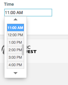
Clicking in our standard Time Only question presents a dialog to select a time by the hour. You can also directly enter the time. Expected format is hh:mm. The customer can add AM/PM but the answer is always stored in 24 hour format.
Form, Element, and Field Details
The right hand side of the builder contains the details of the form, element, or field selected in the center portion of the builder. The options displayed may be slightly different for each type of item, but the function of each component functions the same way when it is displayed.
Form Details
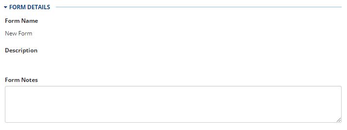
Form details contains the form name and description (as read only) and provided a place for additional form notes. This is a great place to put additional development notes for the form.
Bridged Resources
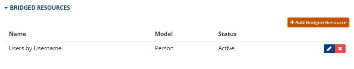
It is here, in bridged resources within the form, that all bridge queries that will be used within the form, whether in script, events, or field options, will be defined. All Bridge Mappings/Queries defined in the space will be available for configuration.
Choices
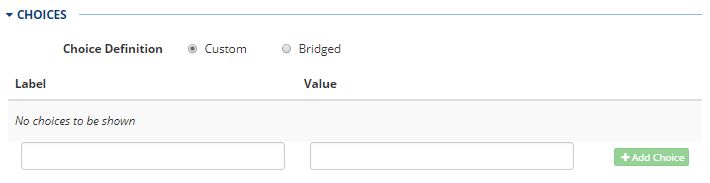
You will see a Choices section for checkboxes, dropdowns, and radio fields. This is where you configure what choices, or options, are available to the user for that field. There are two key things to note here.
- Choices can be hard coded or pulled from a bridge. It is often helpful to pull any choices that may ever change (available conference rooms, for example) using a bridge rather than hard-coding them. That way, when the data changes, the data in the source of record (AD, Datastore, etc) can change but you don't need to go through your change process to change the "code" in the form.
- Choices have both a label (visible to the user) and a value. It is the value that is saved. This allows you to present the user with the name of a conference room, for example, but for you to store and use the unique id.
Display
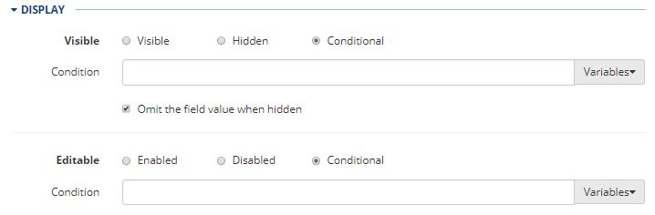
Display will have one or two sections depending on whether it is an element for a field. If present it will always have Visibility. This controls whether or not the field is visible. This can be conditional, basically what you would put in the if part of a javascript if statement. When conditional, if the condition evaluates to true, the field/element is visible. You can also select if a field removes any value already present in the field and doesn't allow values to be set when it is removed.
The other option under display will only be present under fields because it is Editable: whether the field is read-write or read-only. This can also be conditional and when conditional, if the condition evaluates to true, the field/element is editable (read-write).
Validation
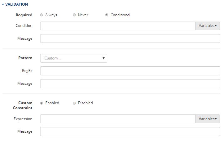
Validation checks the value and existence of a value and stops processing if that requirement is not met. There are three non-exclusive options: Required, Pattern, and Custom Constraint.
Required checked for the existence of a value. This can be conditional, basically what you would put in the if part of a javascript if statement. When conditional, if the condition evaluates to true, the field/element is required. Note that if a field is always required, but conditionally visible, it is still required even when not visible. It is likely, if applying a display condition, that a similar or the same condition may be appropriate for the field.
Note that you can specify a message to be displayed if the required value is not provided. A default message is available, but may not be the desired text for communicating the issue to the user, especially if the required field is a hidden field.
Pattern provides preset regex patterns for validation along with a custom option. Custom requires valid regex and a message if the pattern is not met. There is a related How To for information on creating regex patterns.
Custom constraint includes validation based on other options with the form or answers. Form information, attributes and answers are available to use. Like a custom pattern a message must be provided if the constraint is met. Examples of this are limiting an attachment field to only allow upload of XLS files:
value.filter(function(item) { return !item.name.match(/\.xls$/i) }).length === 0The corresponding message might be:
Please upload only .xls spreadsheets into this field.Events
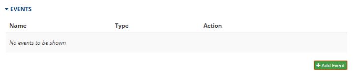
The event section is where events associated with that element or field are and where you can create new events. The events available may differ by item. For example, load and submit events are available for a page, but change events are available for a field.

Events provide you with the ability to do something based on an event (load, submit, change) on the form. This could be a set fields action (generally leveraging a bridge) or a custom script. Events are flexible and so extremely powerful and have further documentation all to themselves. However, basic usage is also extremely simple. Add the event and then fill in a name, an event (load, submit, change, etc), and a type (set field or custom), then either chose the fields to set or enter your script and save.
Render Attributes
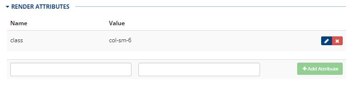
Render attributes are attributes added to the field or element in the HTML when it renders. This is often, as pictured, classes. However, it can be anything that is necessary for desired functionality. Some libraries request or require certain render attributes, or sometimes having certain render attributes simply makes some custom scripting easier. This is just another tool provided to assist in building the best possible solutions with the platform.
Advanced
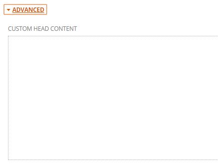
Advanced always contains advanced, lesser used features for an element. For the form, it is the custom header content. This is a way to define additional scripts and styles that will be used in only this form. This isn't as commonly used because the majority of scripts and styles are shared across various forms and are more appropriately up in the theme/bundle.
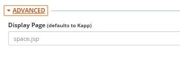
As previously described, Advanced provides the Display Page for the Page. This allows you to specify a different display page for this service item from the standard applied by the kapp and form settings. Since it is rare to have one form display differently from the others in its kapp so completely, this is under Advanced.
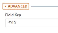
For the field, this shows the field key used at the DB level. Since this is assigned by the system and should not be changed without a very important and specific reason, this is also tucked away under Advanced.
Updated 8 months ago