Form Builder Elements
Overview
This topic outlines the various elements available for use when building forms.
Form Header
The form header displays basic information about the form and includes several options for interacting with the form. Along with standard functions such as Undo, Redo, and Save, you can preview forms, reset changes made since the form was last saved, export form content in a JSON file, create a copy of the current form, or view submissions for the current form.

Options available in the form header
Note: Your access/permissions remain the same when previewing, which can occasionally change the experience. Keep in mind how your permissions as an admin or form builder differ from your general end user.
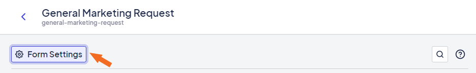
Form Settings
The Form Settings are automatically displayed when you open the Form Builder. To open the Form Settings after navigating to another element, click Form Settings in the left-hand pane to display the Form Settings in the right-hand pane. Here, you can view and define form-specific information.
The Form Settings button is displayed just below the header
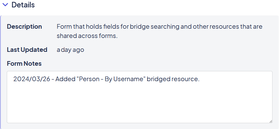
Details
The Details section displays the form's name and description and includes a text box for additional notes. This is a great place to track changes and other notes about the form.
Bridged Resources
While some forms are self-contained, most need some way to interact with other systems and applications. The Form Builder uses bridges, bridge models, and bridged resources to retrieve and present information from other sources.
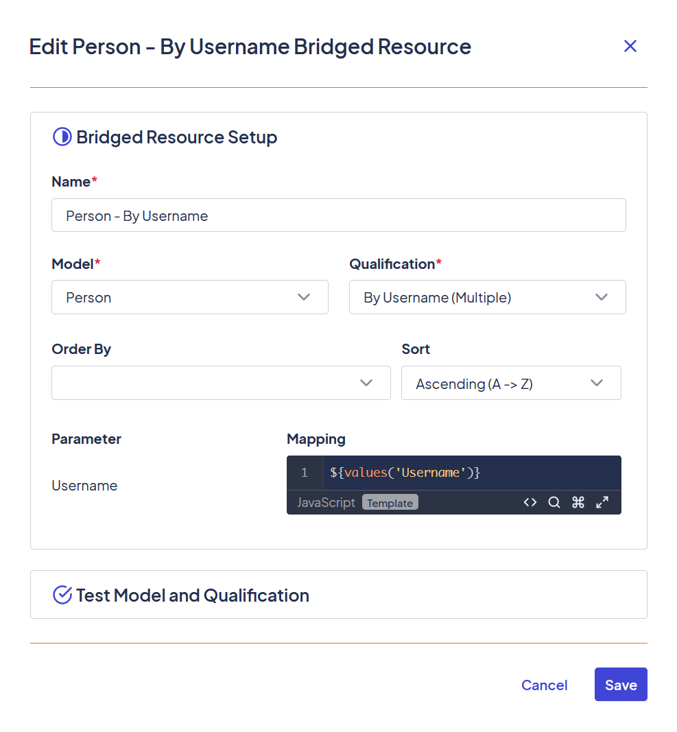
An example of a bridged resource
See Using Bridged Resources in Formsfor more information.
Advanced
The Advanced section defines custom head content. Scripts and styles entered in this section are only used in this form, so it's not a good place to use this section for any content you might use in other forms.
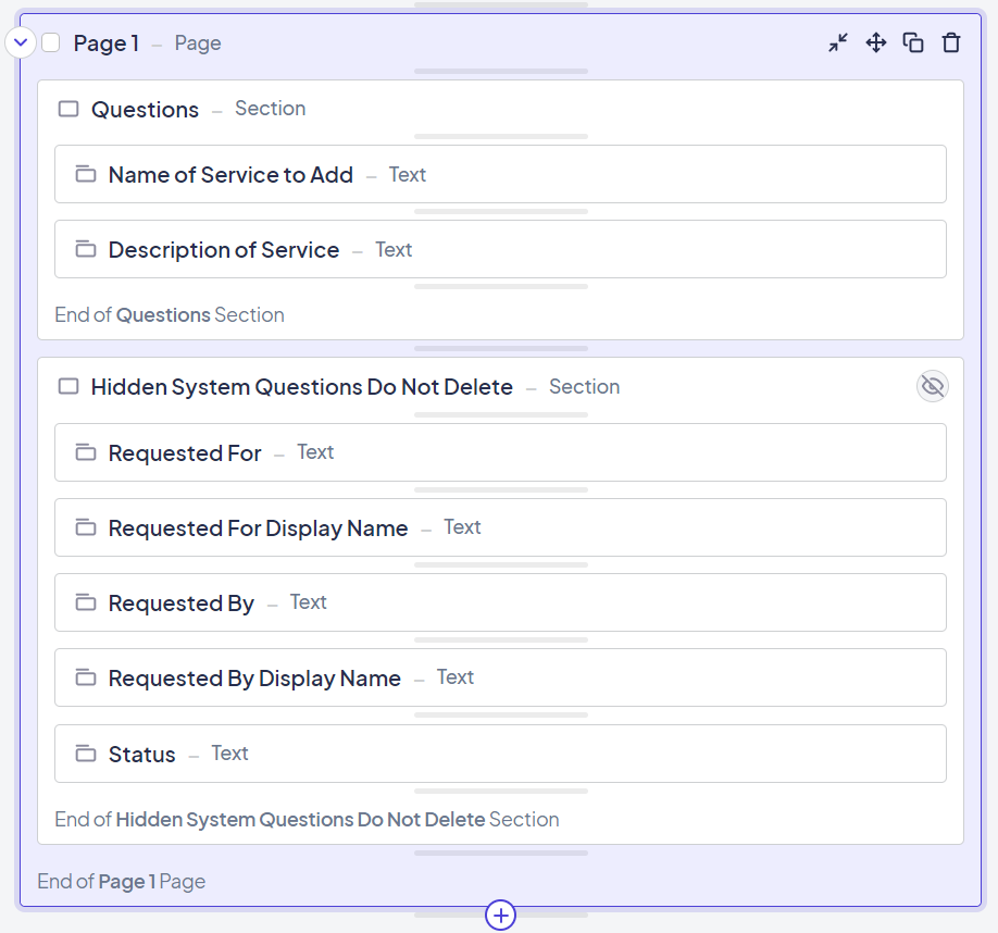
Page
A page is the base sectioning element for forms. Every form must include at least one page.
An example of a page element
Section
A section is a collection of other elements that can be used functionally (for example, for display or removal) or visually (for decorative purposes).
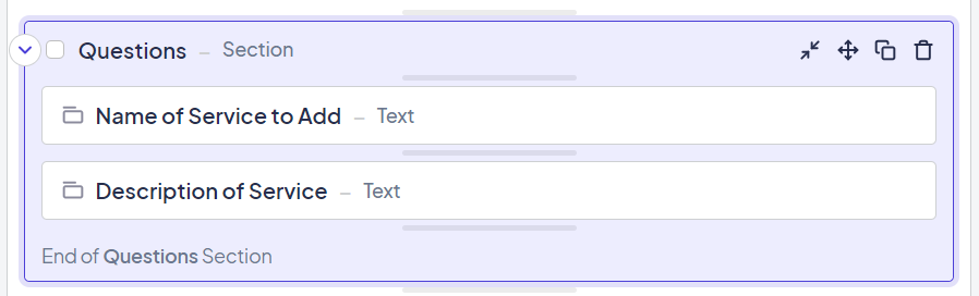
An example of a section element
Content
The Content element allows you to enter a block of HTML or plain text. This element often displays messages, such as confirmation when a submission has been received.
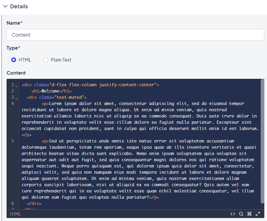
An example of a Content element with placeholder HTML
Button
A button is an element users can select on a form. You can choose between one of four button types:
- Submit Page: Submits the page and advances as validations, submit events, advance conditions, and display conditions specify.
- Previous Page: Returns to the previous page. Changes made since the last time the page was saved are not kept.
- Save for Later: Saves the content on this page and reloads the page.
- Custom: Allows you to define the event or script associated with the button.
Note: All button actions except Custom are preconfigured. If you wanted to go to the previous page but save the current page first, you would need to use a Custom button and use the JavaScript provided for the Save for Later and Previous Page functionalities to achieve the desired button event.
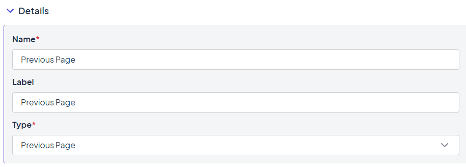
Example of the Previous Page button option
Attachment
The Attachment element inserts an option to upload file attachments for submission with the form.
Checkbox
The Checkbox element displays the options configured in the Choices section in a checkbox format and allows users to select one or more responses.
Note: Checkbox values are stored in an array, not a string. If you need to validate a checkbox in a specific way, remember that entering a string value will not work.
Date
The Date element inserts a box with an interactive calendar. Click the box to open the calendar, then click a date to select it. Arrows along the top take you back and forth one month. The Home icon brings you back to the current month. Dropdowns for month and year allow you to navigate larger changes easily. Alternatively, you can enter a date directly into the text field. The expected format in the field is MM/DD/YYYY.
Date/Time
Like the Date element, Date/Time inserts an interactive calendar but also includes the option to specify a time. If you enter a date only, the field defaults to the current time. The expected format in the field is MM/DD/YYYY HH:MM. You can use either AM/PM or 24-hour time. The answer is stored in ISO 8601 format (YYYY-MM-DD-HH:MM:SSs+00:00).
Dropdown
Dropdown elements display the options configured in the Choices section in a dropdown list.
Radio
Displays the options configured in the Choices section in a radio button format.
Text
The Text element displays a text field with a configured number of rows. This field can range from short values, such as asking someone their name (1 line), to asking someone for comments (3-5 lines). Validation can also range from simple to complex. See the Validation section for more information.
Time
Inserts a box with an interactive calendar. Click the box to open the calendar, then select a time from the list. Alternatively, you can enter a time directly into the box. The expected format is HH:MM. You can add AM/PM to the value, but the answer is always stored in 24-hour format.
Updated 10 months ago