Form Builder Element Settings
Overview
Each element type has a range of settings you can define to customize your forms. This page details the various settings and which elements each setting applies to.
Details
Used in: Page, Section, Content, Button, Attachment, Checkbox, Date, Date/Time, Dropdown, Radio, Text, Time elements
The Details section allows you to specify information about the selected element. Here, you can assign the name of the element as well as additional information based on element type (for example, adding a label to a button or a date element, allowing multiple files for attachment elements, or indicating whether a page is submittable or should act as a confirmation page).
Default Field Values
The Default Value option allows you to specify a text string, variable, or bridged resource as the default response for the element.
Examples
You can leverage the Default Value option in several ways. Here are some examples:
- You can enter a static value of "Yes" for a Yes/No radio button.
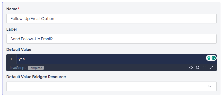
Example of a string default value
- You can set a Requested By field to the User ID of the person who is currently logged in using the Identity variable.
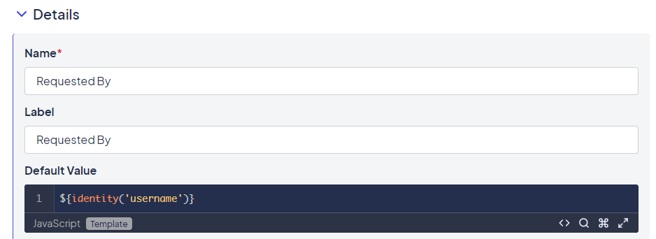
Example of a variable default value
- You can use a bridged resource to populate a default value. For example, you can enter a query of people information that uses the login ID of the individual for a parameter.
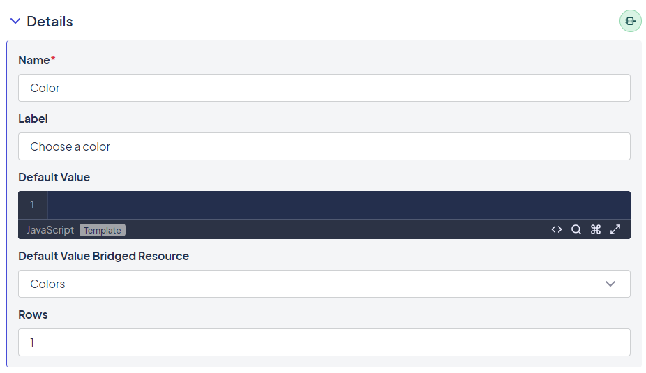
Example of a bridged resource default value
Display Condition
A Display Condition determines whether a page is visible to users. This condition is evaluated at the time the user advances to the page.
Example: If a user saved a record while on the first page of a three-page form and came back to it later, the current display condition on that page would not be evaluated because the user was already on that page. If the display condition had been updated to make the first page no longer visible, users who were currently on that page would still see it. If the intent were to make a page inaccessible, it would require an event to forward people off the page.
The evaluation occurring before the page displays also means that values load events on the page cannot be part of the criteria for determining the display condition. Instead, display conditions must use items on previous pages, form attributes, identity values, and so on.
Advance Condition
An Advance Condition determines whether a user can advance from one page to the next/submit the page.
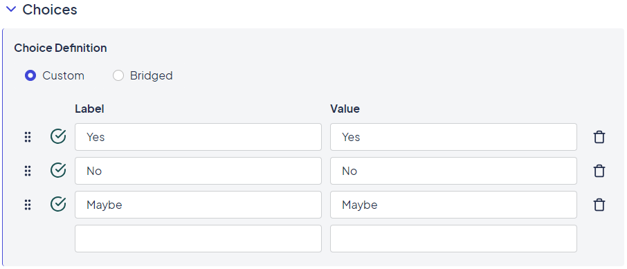
Choices
Used in: Checkbox, Dropdown, Radio elements
The Choices section is used to configure the available choices for certain element types.
Example of an element with conditional display visibility
Choices can be hard-coded or pulled from a bridge. It is often helpful to pull any choices that could change, such as available conference rooms using a bridge rather than hard-coding them. That way, when the data changes, the data in the source record can be changed without affecting the "code" in the form.
Choices have a value and a label that is visible to the user. The value is what's saved. This lets you present the user with one name (for example, the name of a conference room) while letting you store information with a unique ID.
Display
Used in: Page, Section, Content, Button, Attachment, Checkbox, Date, Date/Time, Dropdown, Radio, Text, Time elements
The Display section allows you to configure an element's visibility. Elements can be visible, hidden, or dependent on a conditional (similar to the "if" of a JavaScript if statement). If the condition evaluates to True, the element is visible.
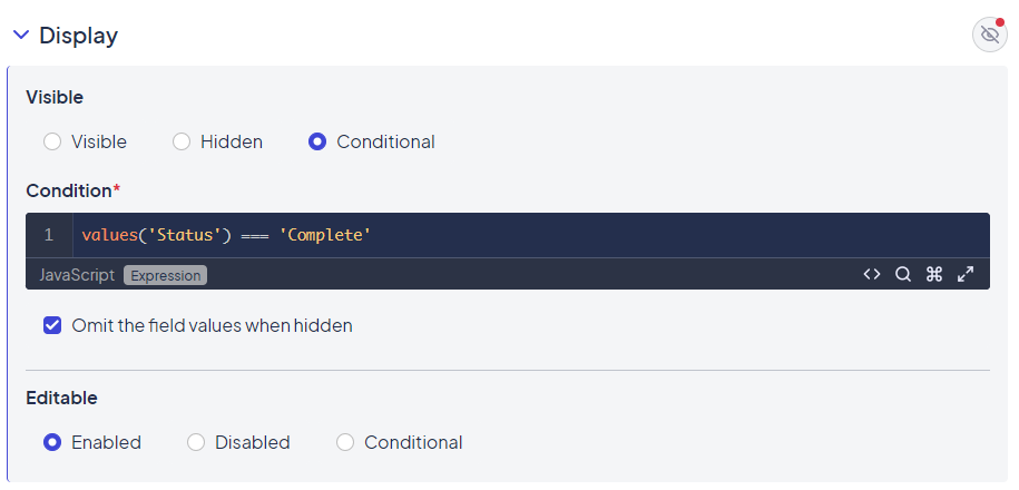
Settings in the Display section
For field elements, you can also specify whether the field can be edited, if editing is disabled, or if editing is enabled only under certain conditions.
Elements are visible by default. When you mark an element as Hidden, it's removed from the page view and the elements that appear lower on the page are shifted up to cover the blank space.
Conditional Expressions
Conditional Expressions let you inject logic and guide users down the right path. Conditional expressions are written in JavaScript and can include variables like element values or attributes defined within the Platform.
The following variables are available by default for use with conditional expressions in the Form Builder:
spacekappformvaluesidentity
Examples
The example below shows how conditional formatting can control when a section is displayed. In this case, the section would only display when the "Employee Department" field equals "Accounting".
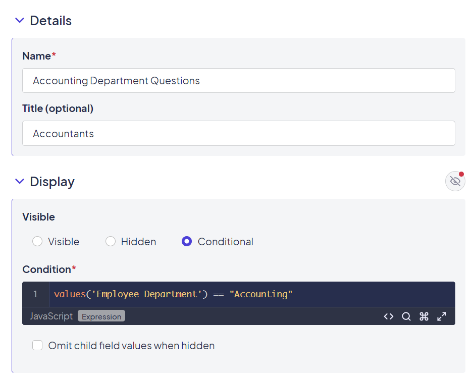
Using conditional formatting to control when a section is displayed
This example uses a conditional expression that includes a check box question field. In this case, since checkbox fields can have multiple values, we use the indexOf JavaScript function to test if the value "Blue" was selected.
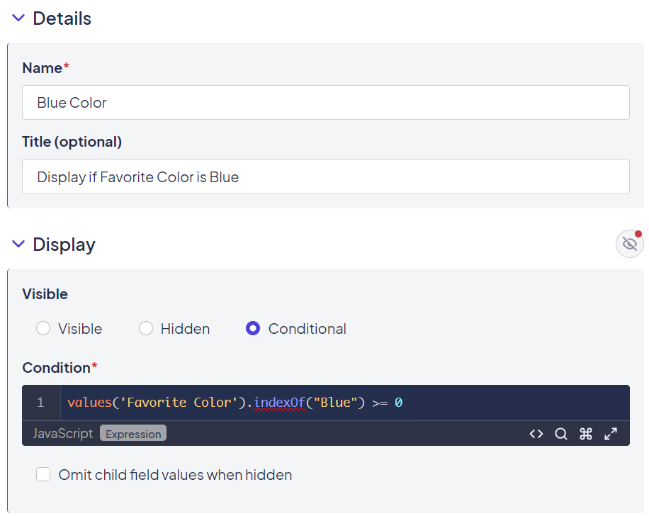
Specifying a particular value with conditional formatting
Using JavaScript to hide and show fields programmatically
Sometimes, you want to leverage available JavaScript functionalities to control a field's display and validation. This can be achieved by creating a specific field for shared forms and setting that field to a value that, per the built-in conditional expression, controls the display in the desired way. However, in situations where the conditional expression is likely to be updated frequently, you can use the following JavaScript to control a field's display directly:
K('field[Field Name]').hide() K('field[Field Name]').show() K('field[Field Name]').disable() K('field[Field Name]').enable()
This method may cause conflicts. For example, if you define a “Visible” condition in the builder of “Hidden” and then call the show method, the form will eventually self-correct and hide the field again. Leaving these conditions to their default state should allow you to use the functions in JavaScript event code.
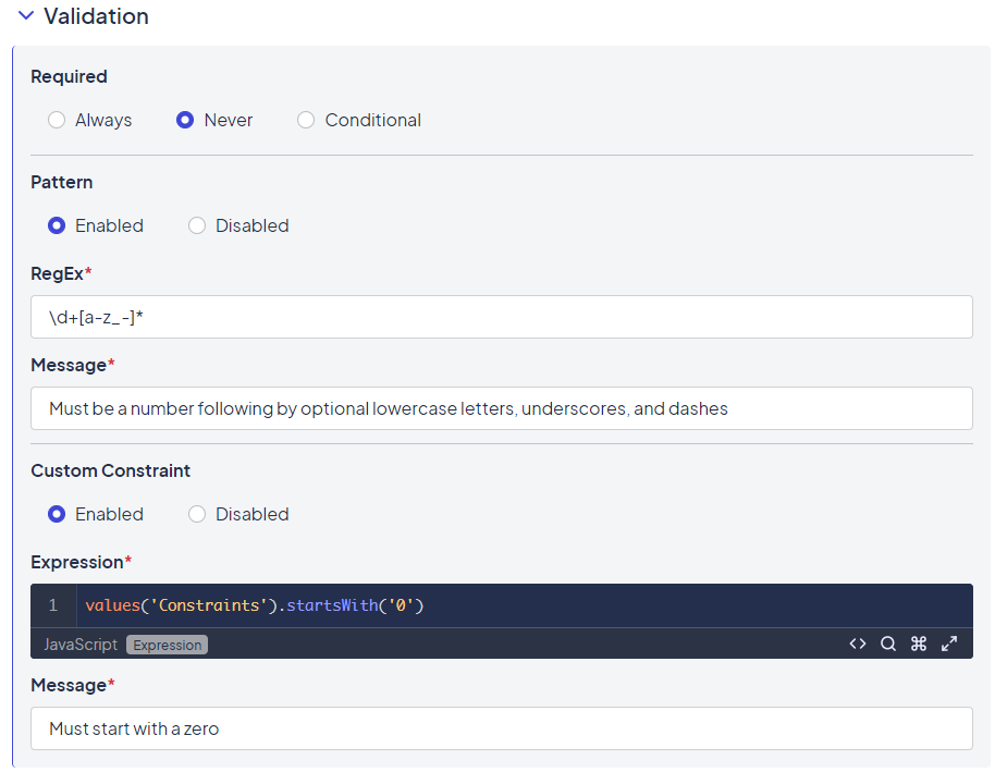
Validation
The Validation section checks whether a value should exist. The processing is stopped if the requirements outlined in this section are not met. Three non-exclusive options are available in this section: Required, Pattern, and Custom Constraint.
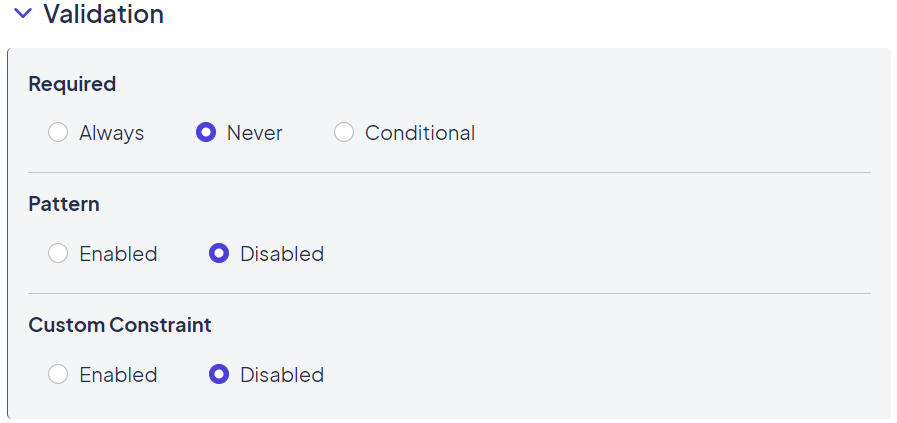
Options available in the Validation section
The Required option checks for the existence of a value. This can be conditional, basically what you would put in the if part of a javascript if statement. When conditional, if the condition evaluates to true, the field/element is required. Note that if a field is always required but conditionally visible, it is still required even when not visible. If applying a display condition, it is likely that a similar or the same condition may be appropriate for the field.
Note: You can specify a message to be displayed if the required value is not provided. A default message is available, but may not be the desired text for communicating the issue to the user, especially if the required field is a hidden field.
The Pattern option is where you can regular expression (regex) patterns, as described in the Validating Fields with Patterns section below.
The Custom Constraint option includes validation based on other options with the form or answers. You can use form information, attributes, and answers. As with custom patterns, a message must be provided if the constraint is met. Examples of this are limiting an attachment field to only allow the upload of XLS files:
value.filter(function(item) { return !item.name.match(/\.xls$/i) }).length === 0
The corresponding message might be:
Please upload only .xls spreadsheets into this field.
Validating fields with patterns
Using regular expressions helps ensure that data is entered properly. Some examples of desired validation patterns are checking for currency (two-digit decimal values), email addresses, and IP addresses.
Validation patterns can be applied to fields in the validation section.
Examples of validation with patterns and custom constraints
You can enter custom pattern validation in the RegEx box, along with a message that will displayed if the field fails the validation in the Message box.
Events
Used in: Page, Section, Content, Button, Attachment, Checkbox, Date, Date/Time, Dropdown, Radio, Text, Time elements
Events make forms more dynamic. They allow you to run custom code, search other systems using bridges, and set fields with data when something happens on a Form.
Events are available on all elements except sections, HTML/text elements, and the preconfigured buttons (Save for Later, Submit, and Previous Page).
Event Types
Not all event options are available for every element. For example, you shouldn't have a Submit event on an Attachment question. The Type of Event determines when the event is fired.
| Form Element | Available Element Types |
|---|---|
| Page / Confirmation Page | Change, Load, Submit |
| Section | Change |
| HTML / Plain Text | Change |
| Custom Button | Change, Click |
All questions have a Change event type. The event is triggered on every change, so you must use the Run If condition to monitor exactly when to fire events. For example, you may not want to fire an event if the field value is null, or you may only want to fire the event if another question contains a specific value.
Event Actions
Two options are available to select when an Event fires: Custom and Set Fields.
- Custom: Provides the opportunity to fire JavaScript. A field is provided with some basic formatting help. Optionally, you can call other available functions from your bundle.
- Set Fields: Lets you set a value to any existing question on the form. You can use a bridge to collect the values or the standard set of variables provided. The variables provided include the values of the questions on the form, the form information, the identity information (for the logged-in user when the event fires), the Kapp and Space information, and so on.
Advanced Features
The features below also enhance the usefulness of events. See Understanding Builder-Defined Events for more information.
- Run If condition: This feature lets you stop the event from firing if the condition evaluates to false.
- Bridge Resource: This option can pull fields from an external source. When used with a Custom action, the bridged resource will execute before any JavaScript is fired. The result will be available using the "resource" variable.
Render Attributes
Used in: Section, Content, Button, Attachment, Checkbox, Date, Date/Time, Dropdown, Radio, Text, Time elements
Render attributes are attributes that are added to a field or element when it is rendered. Common render attributes are class or id, but any number of attributes could be set for use with various JavaScript libraries.
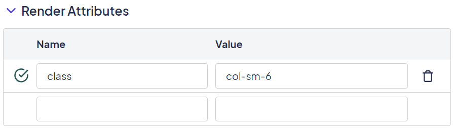
Example of a render attribute used to display information in columns
To apply a render attribute, provide the attribute and its desired value in the render attribute section of the field/element, then save your item. The render attribute is then displayed with the element.

Example of script used for a render attribute
Which render attributes to use varies greatly depending on what libraries are loaded in your particular theme/bundle. Render attributes are all about display and leveraging available options. Attribute validity depends on what is available to your forms when they are rendered.
Advanced
Used in: Section, Content, Button, Attachment, Checkbox, Date, Date/Time, Dropdown, Radio, Text, Time elements
The Advanced section contains lesser-used, more advanced features for an element. The options available differ depending on what element is selected, as described below:
-
Forms: At the Form level, the section is used to enter custom header content, which lets you define additional scripts and styles for use only in this Form.
Note: This option is rarely used because the majority of scripts and styles are shared across various forms and are more appropriately assigned at the theme/bundle level.
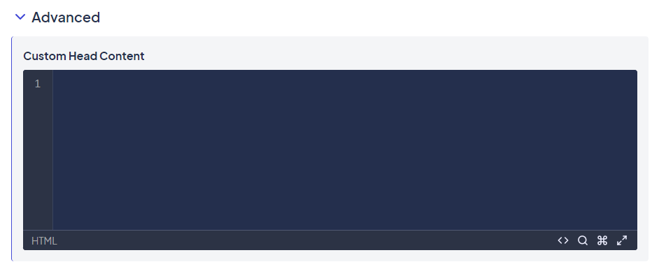
How the Advanced section is displayed for Forms
Fields: At the Field level, the Advanced section contains the field key used at the database level. The system assigns this value. It shouldn't be changed without a specific reason.
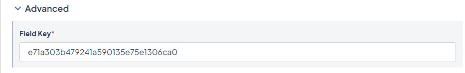
Example of a field key
Bridged Resources
Used in: Form Settings
This section defines all bridge queries that will be used within the form, whether in script, events, or field options. All bridge mappings and queries defined at the Space level can be used for configuration. You can also add new bridged resources from this section.
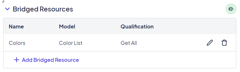
Using a bridged resource to assign a color value
Click Edit (the pencil icon) to edit an existing bridged resource.
Updated 12 months ago