Form Builder
Form Builder is used to construct forms as Platform users will see them. All forms use the same Form Builder.
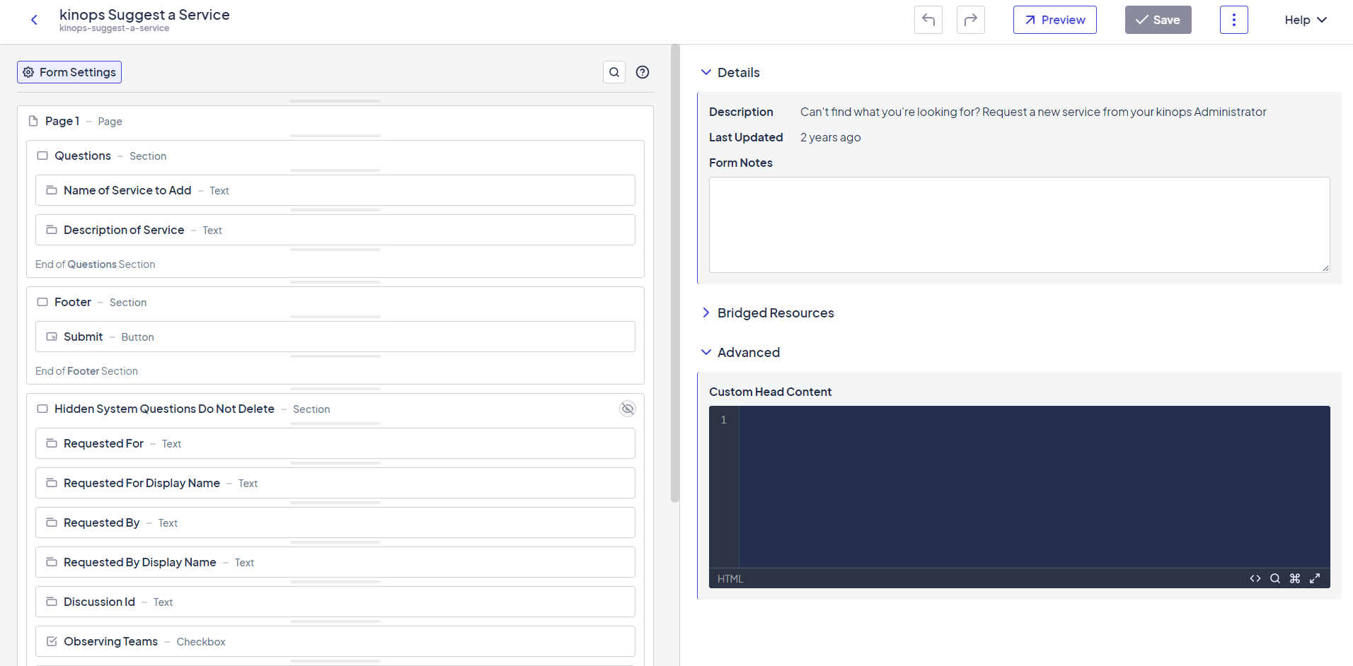
Example of the Form Builder in action
The pages in this guide cover the elements, settings, and interactions available in the Form Builder and best practices when building forms.
Updated 9 months ago
What’s Next
Did this page help you?